Context
I'm a student myself at a gluten-free, organic cooking school run by a teacher I won't name. I love the atmosphere — a different rice-flour-based theme each month, breads and cakes built by hand alongside the teacher. Classes are held at the teacher's home, and for many students — Japanese women living abroad, often with kids in local schools — it doubles as a space to trade information and connect over the experience of living overseas, not just to learn to cook.
Back then, booking was split across three disconnected tools: the teacher messaged students directly over LINE (Japan's answer to WhatsApp), actual bookings went through SignUpGenius, and lesson details were sent separately as PDFs. Students complained that SignUpGenius was ad-heavy, didn't support Japanese input, and felt dated. Some also disliked that their name was visible to other students booked into the same lesson.
Experiencing that firsthand as a student, I proposed to the teacher that we consolidate everything into one modern, easy-to-use app.
I ran requirements gathering as a direct interview with the teacher and confirmed a few constraints going in:
Keep it simple and lightweight, without much ongoing cost
Assume most students would use it on their phones
Never let a booking silently fail — a student thinking they're booked when they aren't was the one outcome to avoid at all costs
Handle personal information with real care
Support a membership tier, where members get early access to bookings
Make the admin screen easy enough to run day-to-day, since she wanted to focus on cooking, not operations
I took on both the design and the implementation myself, building it from scratch with AI as a coding partner — commonly called "vibe coding."
I treated this as more than a Figma handoff: the scope included building something students could actually book through and the teacher could actually run day to day. Even in that early interview, the one failure mode the teacher worried about most was a booking silently failing. During development, I ran into the exact thing she'd described.
The problem
THE BUG THAT PROVED THE POINT
During development, cancellations appeared to complete in the UI, but the seat count didn't decrement and the admin dashboard didn't update.
I traced this to Supabase's Row Level Security silently blocking the update when it came directly from the client (the student's browser) — working as designed, but with no visible error, which made it slow to catch.
The decision
WHERE TO DRAW THE LINE
Rather than forcing the write through client-side RLS, I decided to separate "what a student should be able to do directly from the browser" from "what the cancellation flow actually needs to do." I built a dedicated PATCH /api/bookings route that uses the Supabase service-role key server-side, and routed cancellations through it instead.
A few other deliberate calls shaped the admin dashboard:
Two-tier publishing (member-early-access vs. general). This mapped to a real product requirement: a $40/year membership perk that includes early access to bookings. Turning on general publishing auto-enables member visibility too, so the teacher can't accidentally create a state where the public sees a lesson but members don't.
Dropped the calendar view for a date-grouped, collapsible list. The real usage pattern was scanning "what's coming up and who's in it" daily, so I optimized for information density over a bird's-eye calendar view.
A minimum-headcount warning card. Lessons run at the teacher's home with a hard cap of 6 seats and a minimum of 4 to run at all — below that, she has to actively steer students toward a different date. This card surfaces that directly in the dashboard instead of the teacher tracking it herself. Deliberately not automated: a lesson going ahead is confirmed automatically by the booking email itself, but if a lesson doesn't reach minimum headcount, the teacher reaches out to affected students personally rather than the system sending an automated cancellation notice — a case where I chose to leave a human touch in rather than automate it away.
Referral tracking for first-time guests. Since classes are held at the teacher's home and are invite-only for security reasons, first-time guests are required to name who referred them.
Differentiated confirmation emails for first-timers vs. returning guests. First-timers receive an email that includes the home address; returning guests get a shorter version, balancing what people actually need against how much of the teacher's home information gets shared.
Execution
I owned design, database schema, API implementation, and deployment end to end, on Next.js (App Router), Supabase (Postgres / Auth / RLS), Resend for email, and Vercel for hosting (with a daily cron to keep the Supabase free-tier project from pausing).
Students: browse lessons, book a seat, see live availability, cancel with a confirmation step and automatic email, bilingual (Japanese/English) UI
Admin: monthly metrics, a date-grouped collapsible lesson list, two-tier publishing, low-enrollment warnings, CSV export for backups
I don't write code fluently on my own, so I worked through implementation in dialogue with Claude Code, and verified behavior by actually running the booking-to-cancellation flow myself in the browser rather than relying on the AI's output alone.
At one point, Claude token usage got expensive enough that I switched to a free-tier plan for coding guidance and made the GitHub edits myself directly. What started as a cost-saving workaround turned into a genuine learning gain — working through the code myself built a level of understanding I wouldn't have gotten from prompting alone.
When I showed an early prototype to the teacher, she asked to shift the palette toward a red-based, earth-tone scheme, matching the branding of a cafe she'd previously run. I reworked the color palette accordingly, explored icon options, and ran an accessibility check on contrast for the new colors.

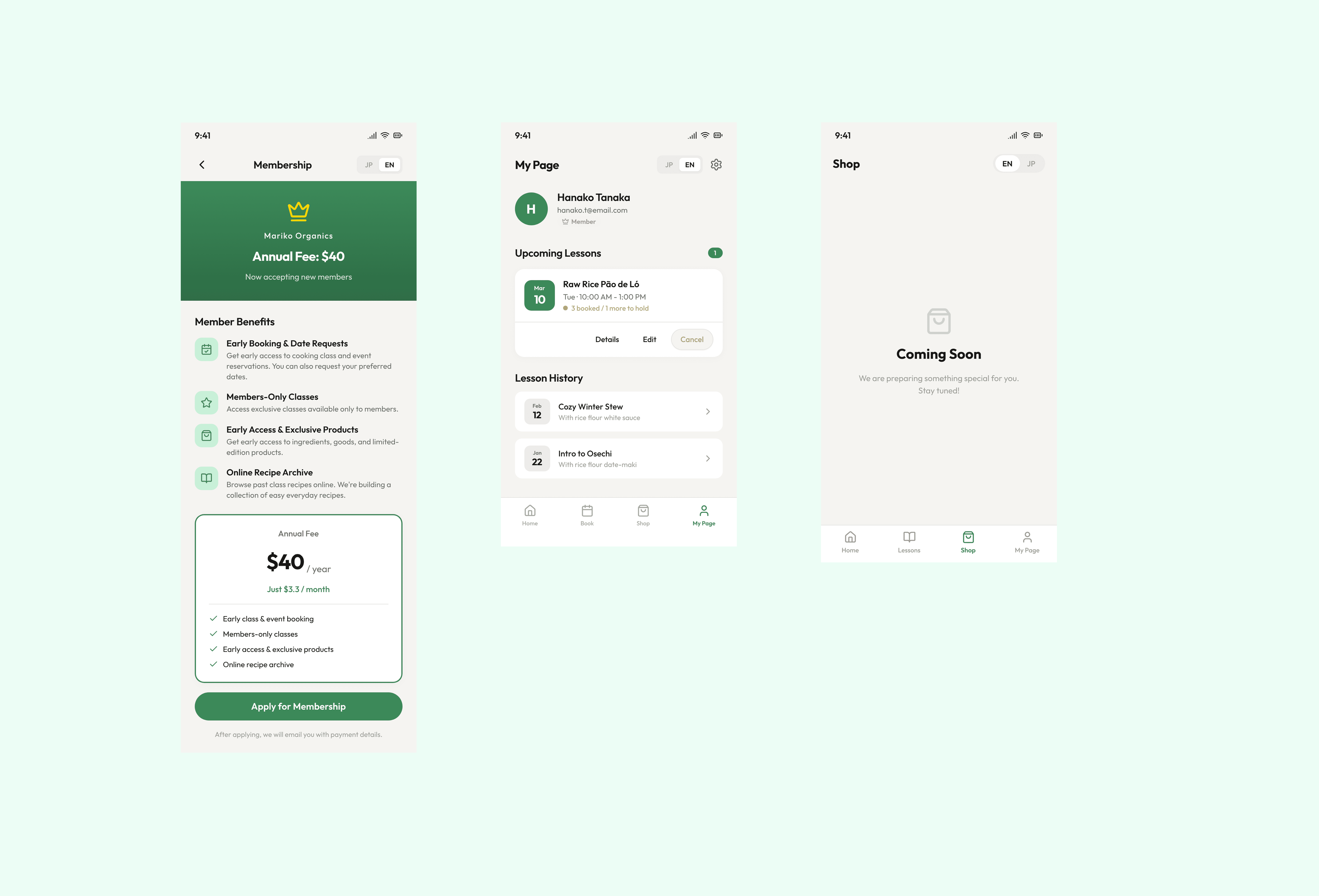


outcome
The app ran in real use, with roughly 100 active users and about 20 students on file (approximate, based on the teacher's own figures). The teacher and I tested it together and confirmed everything works without issues; all that's left now is to relaunch it publicly.
What I can say qualitatively: the old LINE/SignUpGenius/PDF process had real problems — hard-to-track seat availability, missed cancellation notices — and this replaced it with something the teacher could run on her own.
The teacher isn't especially tech-savvy, so I also put together a simple manual for her, which she was genuinely happy to receive. Shipping the app was never the finish line — what happens afterward, in day-to-day operation, matters just as much. Some basic explanation of how it works, plus ongoing operational support, turned out to be essential, not optional.